 Create Chart
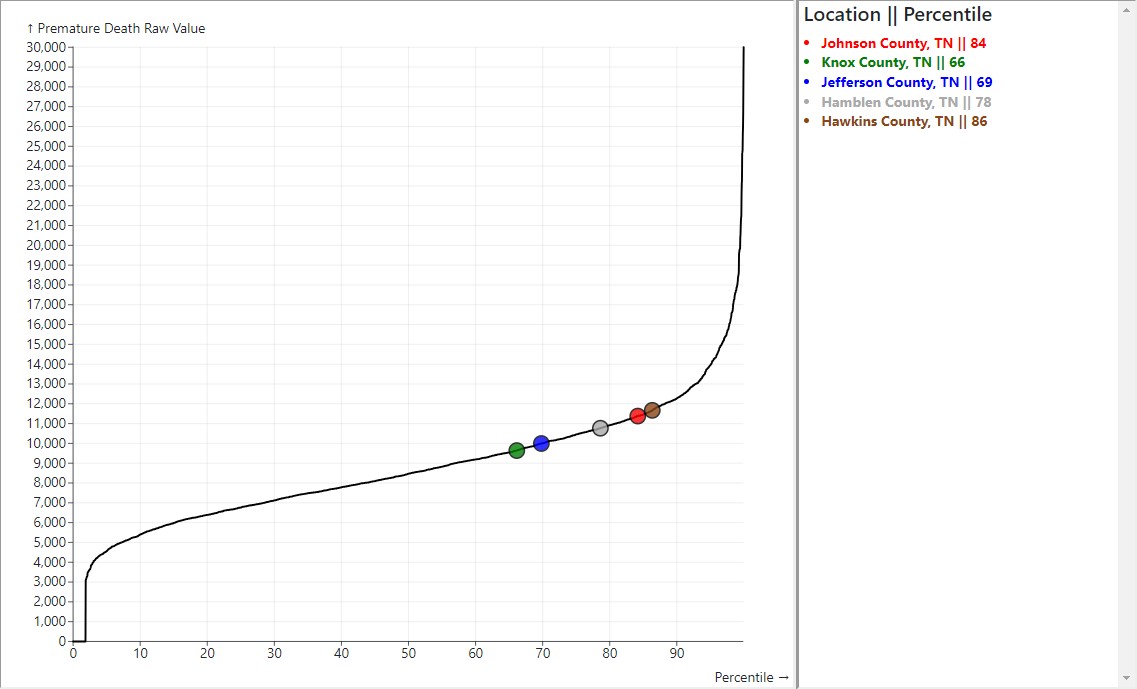
This application generates annotated percentile charts of health indicators for the United States and its territories, using data compiled annually by the University of Wisconsin's Population Health Institute's County Health Rankings (CHR) Project. As shown above, these charts pinpoint the locations of user-selected counties and states on charts for more than 700 such indicators.
To get started,- Select Create Chart
- From the dropdown menu that appears, select a year.
- From the dropdown menu that then appears, select an indicator.
- In the display that then appears, select the counties to highlight on the chart.
Additional controls on the 'Create Chart' page allow for the removal of zero and null values from the chart, for saving groups of counties and states to a local file, and for the retrieval of these groups from those files for generating related plots.
For more information about the various health indicators, please reference the County Health Rankings (CHR) Project's Data Dictionary (XLSX) files found on their Download page.